

Trust is the foundation of fintech. Whether it’s a digital bank, investment platform, or accounting tool, users are trusting your product with their money, personal data, and decision-making. That trust can’t be earned through flashy design or buzzwords alone. It’s built through clarity, consistency, and usability, and increasingly, through how your platform performs in AI-driven environments.
Here’s how smart fintech design goes beyond the interface.
UX Is the New Trust Signal
Most users don’t read the fine print, they trust their instincts. And their instincts are shaped by design.
If your signup flow is confusing, your dashboard feels cluttered, or your forms throw unexpected errors, users start to question more than the UX. They question your brand. Are you reliable? Are you secure? Can I trust this with my money?
That’s why great fintech design starts with clarity, not complexity. A few core UX principles that signal trust:
- Consistent design patterns: Buttons, colors, and icons should behave the same way across your product.
- Clear, scannable content: No jargon. Break content into bite-sized, user-friendly language.
- Guided actions: Instead of overwhelming users with choices, guide them toward the next best step.
- Visual hierarchy: Use layout and spacing to emphasize important actions — especially anything involving sensitive data or money movement.
- Error handling: When something goes wrong, the interface should explain it clearly and offer a helpful next step (not just a red highlight).
For fintech platforms, trust isn’t just a UX metric. It’s a business metric.
Accessibility Isn’t Optional, It’s Strategic
Accessibility is often framed as compliance. But in fintech, it’s also about market reach, performance, and brand reputation.
Millions of users rely on assistive technologies like screen readers, voice control, or keyboard navigation. Many others face situational impairments, like trying to check a balance in direct sunlight or with limited WiFi. If your platform isn’t designed with these users in mind, you’re leaving revenue (and trust) on the table.
Key accessibility practices that benefit everyone:
- Semantic HTML: Screen readers rely on proper heading structure, button labeling, and ARIA roles.
- Color contrast: Ensure your color palette meets WCAG guidelines so users with low vision or color blindness can navigate with confidence.
- Keyboard navigation: Make sure all key functions — from login to transactions — can be completed without a mouse.
- Alt text on icons and charts: Visual data is common in fintech. Make sure it’s accessible by describing what the visuals convey.
Accessibility isn’t about meeting the bare minimum, it’s about ensuring every user, regardless of ability, can safely use your product. That’s the definition of inclusive finance.
For more on this overlap, read about how AX (Agent Experience) and accessibility work hand in hand.
UX for Fintech Onboarding: Speed + Reassurance
Fintech onboarding is a make-or-break moment. It often involves legal disclaimers, identity verification, and sensitive data collection, which makes the user experience even more critical.
Best practices we apply across fintech clients:
- Progress indicators: Users feel more confident when they know how many steps are left.
- Smart defaults and autofill: Reduce manual input where possible.
- Save and resume options: Especially for onboarding that takes more than a few minutes.
- Microcopy that reassures: For example, “Your data is encrypted and never stored on our servers” right below a form field.
Small UX wins can lead to big performance gains.
AI Readiness: The New Frontier of Fintech Visibility
SEO used to be the only game in town. But today, it’s not just search engines crawling your site. AI systems crawl and parse, and building trust is key to helping them understand your content.
Tools like ChatGPT, Google’s AI Overviews, and agentic AI products are rapidly becoming the new gateways for information discovery. If your fintech brand isn’t structured in a way that these systems can parse, summarize, or cite, you could be left out of the conversation, even if your product is best in class.
What does AI optimization look like?
- Structured content with semantic HTML: AI models need clarity to parse.
- Descriptive, consistent headings: Don’t just say “Overview,” say “Overview of Our Business Credit Line Tool.”
- Schema markup: Help models understand the relationships between pages, people, and products.
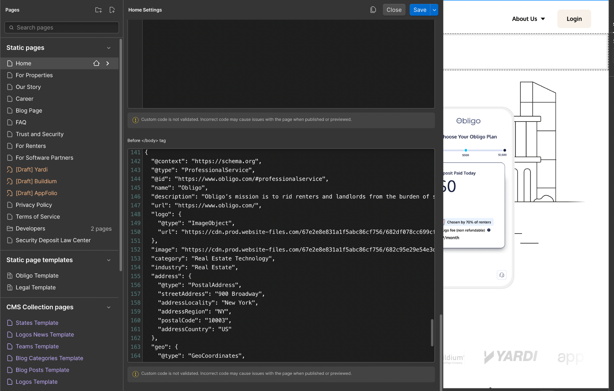
- robots.txt and llms.txt files: These files guide crawlers, and increasingly, LLMs, on what content they can use and how.
Pro tip: Not all AI agents follow llms.txt yet, but the protocol is gaining adoption. Preparing now gives your fintech site a head start in AI-driven discovery. For a step-by-step guide on generating and implementing llms.txt files, read SEO for ChatGPT: Help LLMs Understand Your Website.
From UX to AX: The Role of Agent Experience
We’re entering the Agentic Era where users are delegating more tasks to AI.
Whether it’s a startup founder using a research agent to compare funding tools, or a business owner asking ChatGPT for the best invoicing platforms, your fintech brand is increasingly being described by machines before users ever click through.
That’s where AX, or Agent Experience, comes in.
AX is the practice of making your site understandable to AI agents. It overlaps with UX and SEO, but with new layers of consideration:
- Does your page structure make it easy to summarize key offerings?
- Are important policies (like rates, fees, privacy) clear and crawlable?
- Do your headings and alt text describe what the content actually shows?
Fintech companies that get ahead on AX won’t just be found, they’ll be recommended.
Real-World Examples
Composite has worked with a number of forward-thinking fintech and finance-adjacent platforms to bring these strategies to life:
- For Obligo, a fintech company reinventing rental deposits, we rebuilt their site on Webflow with semantic structure, fast load times, and scalable CMS architecture, helping them stand out to both users and AI agents.
- For a credit data API startup, we designed a modular marketing site that clearly differentiated between developer docs, product benefits, and compliance info, improving both onboarding and discoverability.
Across each project, our UX strategy ties directly to conversion, trust, and long-term scalability.
Why We Use Webflow for Fintech Design
Fintech platforms need to move fast, without compromising structure or security. That’s why we often recommend and build on Webflow.
Benefits include:
- Visual CMS control for marketing and legal teams (no dev bottlenecks)
- Built-in performance optimizations (clean code, image compression, lazy loading)
- Granular accessibility control for ARIA labels, contrast checks, and keyboard flows
- Schema and meta-tag configuration for SEO and AI readiness
- Staging environments for safe reviews before launching
Webflow doesn’t just make beautiful sites, it makes maintainable, scalable, high-performance ones. That’s what fintech needs.
Designing for Trust Means Designing for the Future
Fintech is evolving and so are the expectations around what a “credible” platform looks and feels like. The best way to build trust is to remove friction, embrace clarity, and prepare for the future of digital discovery.
That means:
- Building accessible, inclusive interfaces
- Structuring content for both people and machines
- Moving fast, but with systems and standards
Whether you’re launching a new financial product or modernizing an enterprise platform, the path forward is clear: invest in UX, AX, and accessibility now, and your users will thank you with their trust.